

What’s the weather like in your area? Are temperatures cooling or warming? Just stepping outside, it’s usually easy to feel the changes. As temperatures change, so do the behaviors of animals. Take for example, the Snowy Tree Cricket. It’s an amazing little creature. As temperatures change, so do the sounds of their chirps. Check out this video.
Interestingly, people’s buying and selling behaviors change based upon the seasons as well. Most housing markets have fluctuations in buyer activity, depending on the time of year. In many parts of the United States, peak buying season is in the summer, while things slowdown in the winter months. You can see this in the chart below.
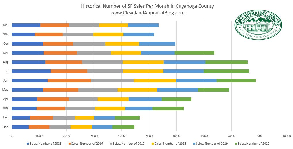
Typically, the highest number of active listings occurs in the summer months in Cuyahoga County, with the lowest number of listings typically being in the winter months. Except for 2020, where inventory has plummeted, as you can see below. This is no doubt partially due to the pandemic, among other factors.

In addition to seasonal changes in the housing market, housing markets also go through larger cycles. How can we determine the temperature of the market? There are some indicators we can look at. Let’s call them the “Snowy Tree Crickets of Housing”.
Days on market (DOM) – The time it takes homes to sell is one indicator. The faster homes are selling, the hotter the market. In many areas in Northeast Ohio, many homes are selling in days, with multiple offers. Notice how different the marketing times are for 2020 in comparison to other years. This is one indicator that we are in a hot market!

Inventory – When there is a high demand for homes, with a limited supply of homes on the market, this typically drives prices up, as buyers compete with one another to purchase homes. We are also seeing this in most areas of the country. The lower the inventory, with high demand, the hotter the market. You can see that the median sales price in Cuyahoga County peaked to all-time highs this summer, while inventory levels have dropped. Interestingly, inventory levels in Cuyahoga County have started to rise in July, which usually doesn’t happen until the spring. Of course, nothing is normal on any level in 2020.

List to Sales Price Ratios – The list to sales price ratio is a measure of the difference between the home’s last list price and what it sells for. The closer we get to one hundred percent the hotter the market. In some areas the average list to sales price ratios are exceeding one hundred percent, as many homes sell above their list price in bidding wars. Clearly, the chart below indicates that the housing market in Cuyahoga County is hot!

If you don’t have access to the Multiple Listing Service, where you can go to obtain this information? If you’re in Northeast Ohio, you can visit my blog or my other website at www.AspenAppraisalServices.net. I’ve started creating charts to show what’s happening in my market. While look at this data on every appraisal, I have not shared much of it. I think that it’s helpful to share this information with the public, so that you can see what real estate professionals are seeing.
If you’re in market other than Northeast Ohio, see if there is a local appraiser in your area who shares this information with the public. Here are some of my favorites… Ryan Lundquist’s Sacramento Appraisal Blog, which covers the Sacramento area, as his blog name indicates, and Jonathan Miller’s Housing Notes, with fantastic data on the New York market and other major markets around the country. If you’re in the Birmingham, Alabama area, check out Tom Horn’s blog at the Birmingham Appraisal Blog. If your in the Dallas Fort Worth and Rural North Texas area, check out Shannon Slater’s blog at the DW Slater Blog. If you’re looking for more information on a more macro-economic level, check out Phil Crawford’s Crawford Report, for monthly up to date information on what’s going on in the economy. There are many others that I have not mentioned. Even if you don’t live in these areas, these appraisers provide great information that you will enjoy.
I hope you enjoyed this little analogy about the Snowy Tree Cricket. As the weather continues to cool, enjoy refreshing autumn temperatures! And when changes in the housing market take place, you can be sure that hard working appraisers across the country will be reporting on it.
If you’re looking for something to do before the weather gets too cold, you might try building a squirrel obstacle course. Enjoy!
Have a great weekend everyone! Be safe out there!
Looking for a qualified real estate appraiser in your area? Go to www.FindMyAppraiser.com
![]()
If you enjoy listening to podcasts, check my new podcast out. I hope you enjoy it! You can find me on Apple Podcast, iHeart Radio, Spotify, Google Play Music, Sound Cloud, Radio.com, RadioPublic, Deezer, Breaker, Stitcher as well as other feeds.
You can also listen right here at Cleveland Appraisal Blog!
 www.homevaluestories.libsyn.com
If you are interested in stats, and nothing but the stats, for neighborhoods in Northeast Ohio, check out my other podcast. In it, I provide short episodes that provide you with stats on median sales prices, marketing times, housing inventory and other related stats, on specific neighborhoods in Northeast Ohio. You can find me on Apple Podcast, Spotify, Google Play Music, Breaker, Overcast, Pocket Casts, Radio Public or you can listen right here at the Cleveland Appraisal Blog.

www.anchor.fm/cash-appraiserstats.com
Here are some links to other articles I’ve enjoyed recently! I hope you will also…
The U.S. Housing Market: Greatest Of All Time (GOAT)? – Housing Notes by Jonathan Miller
The aggressive & slowing housing market? – Sacramento Appraisal Blog
Will The Appraiser Give Me Full Credit For My Landscaping? – Birmingham Appraisal Blog
Tales of a Trainee at Appraisal Camp Sedona – APPRAISAL TODAY
September Newsletter – Inventory Falling with the Leaves – DW Slater Co Blog
Discover more from Cleveland Appraisal Blog
Subscribe to get the latest posts sent to your email.
Great stuff Jamie. I especially like your bar chart showing monthly volume. I’ve never made one like that, but it’s on my radar now. It’s interesting that days on market isn’t down further in light of how low inventory is. Though in my market it’s really just down a few days or so from last year, and that’s not so easy to see on a visual. Thanks for the shoutout too. I appreciate it.
Thanks Ryan! The days on market are less in some neighborhoods. However, county-wide it’s a little higher. I’m glad you liked that chart! You are very welcome for the shout out! You do a great job in all of your posts! 😃 Have a great weekend my friend!
This is great, Jamie. I have reviewed some reports where the appraiser inserts a basic Excel chart with no commentary about it. It left me wondering, “So what.” You’re charts are easily understood stand-alone and made all the better with your explanatory comments.
Hi Cynthia! Thank you so much for saying so! I’ve seen what your describing as well. I hope you’re doing great! Have a fantastic weekend my friend!